A highly skilled real estate professional dedicated to delivering an elevated home-buying and selling experience. With a client-first approach, she combines market expertise, strategic negotiation, and personalized service to ensure every transaction is seamless and rewarding. Specializing in Downtown Frederick, Lori’s deep understanding of the market allows her to guide clients with confidence
DELIVERABLES
Branding
Website
Print Material
Social Media Posts
Email Campaigns
OBJECTIVES
Refining her real estate brand to enhance lead generation, maintain autonomy, and elevate her online presence. She seeks to establish a cohesive identity that reflects her values—relationships, community engagement, education, and approachability—while ensuring seamless transitions between software platforms when needed.
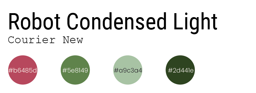
The branding began with colors inspired by a cherished painting, making them both personal and meaningful. The chosen font ensured legibility across platforms, reflecting her preference for clear communication. Photography sourced through trusted connections influenced the overall style, contrast, and tinting, reinforcing her relationship-driven approach..
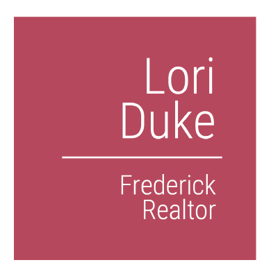
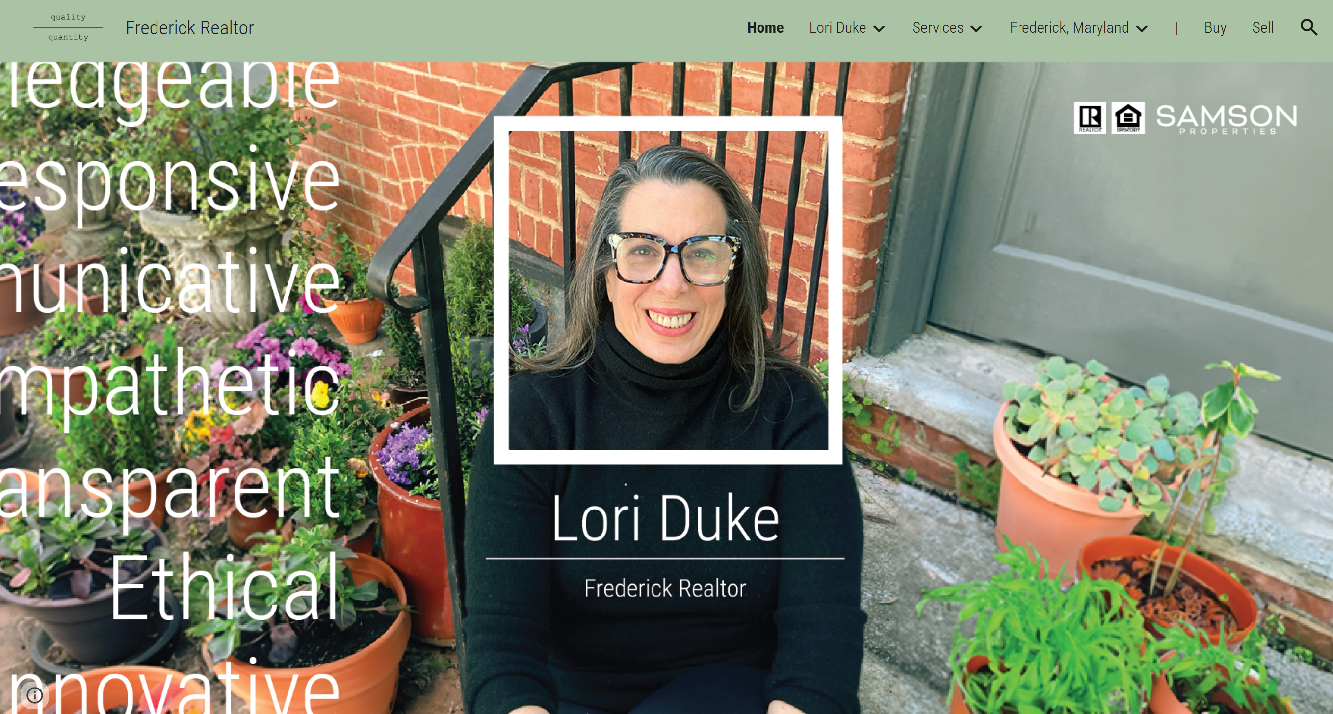
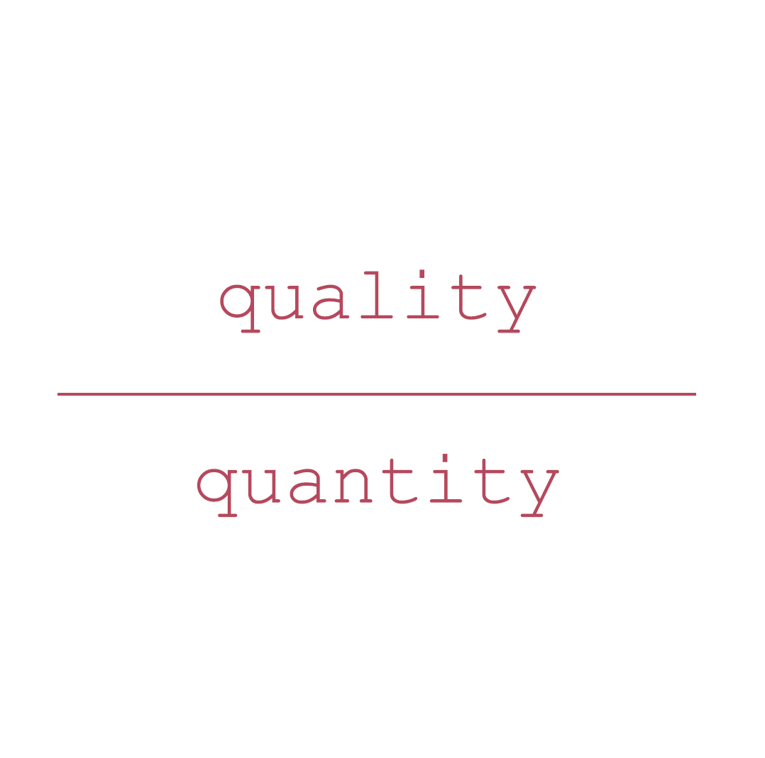
The website established Lori’s online presence. The homepage featured her on a doorstep, mirroring a client introduction. Professionally dressed and framed by potted flowers, she appeared warm and approachable. A square overlay became a key brand element, while her name and title followed a structured format, reflecting a quality-over-quantity approach that highlights her efforts to exceed industry standards.
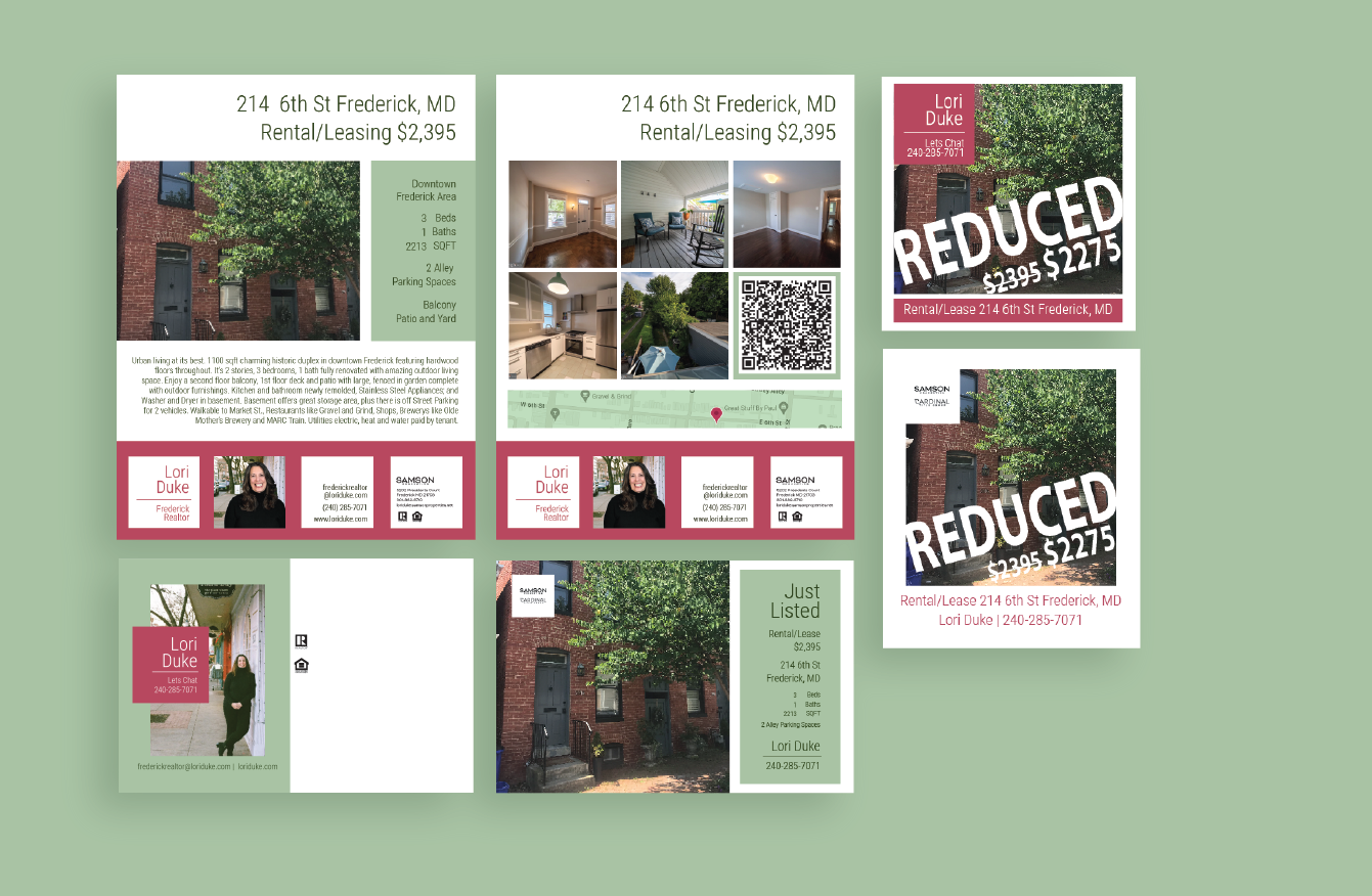
The rental and sales property campaigns continued to reinforce Lori’s brand identity through structured text orientation and square-blocked layouts. These campaigns encompassed MLS listings, postcards, flyers, email marketing, Facebook and Instagram posts, and engagement-driven social media strategies.
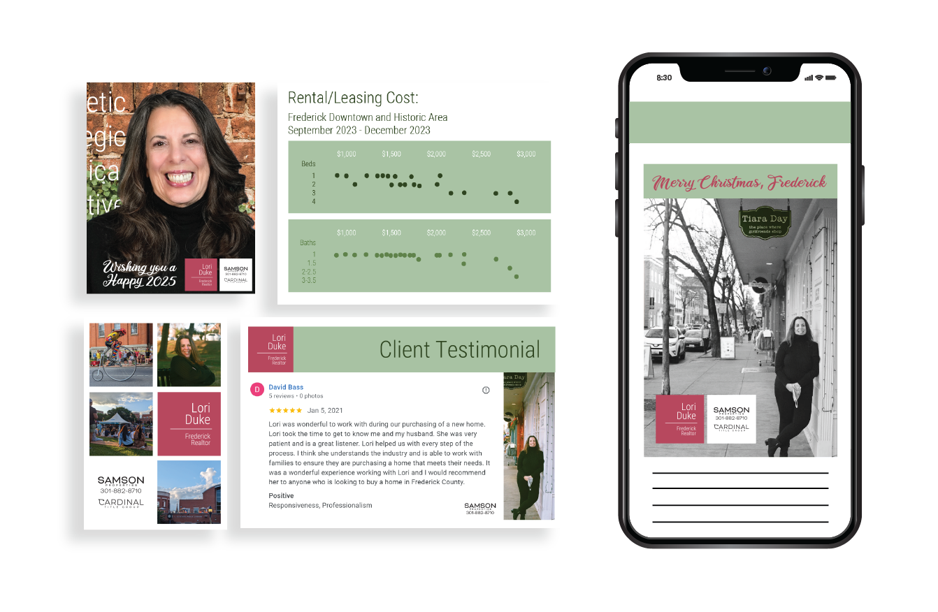
Lori’s social media content was curated to establish her as a knowledgeable resource in real estate, local events, and the housing market. Client testimonial posts further reinforce her trustworthiness. The brand’s core green tones are consistently used throughout posts, while pink serves as a strategic accent, drawing attention to key content—most notably her name.
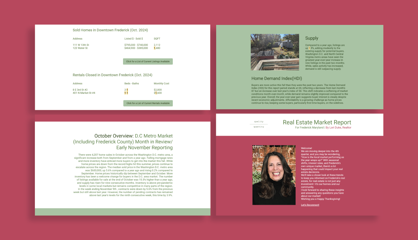
Lori’s newsletter underwent two revisions, with the final version truly capturing her brand essence. It opens with a welcoming message from Lori alongside her picture set against a pink background. The layout is structured for readability, with alternating white and light green backgrounds organizing each section. The text is predominantly left-aligned for consistency and encourages readers to give additional attention for it is atypical. The conclusion reuses the first image from her website, reinforcing other digital presences.