Stratman Sports is a premier destination for competitive and recreational sports enthusiasts, offering top-tier leagues, training, and events. Whether you’re a seasoned athlete or a newcomer, their programs provide the perfect blend of skill development, teamwork, and fun.
DELIVERABLES
Logo
OBJECTIVES
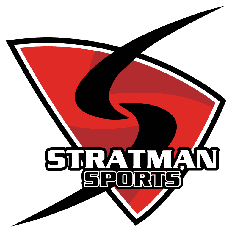
A completely rebranded logo that better reflected their identity. They had explored previous design concepts and wanted to collaborate with another designer to refine the final look. As a recognized volleyball league facility, they required a versatile design that allowed for the integration or removal of sport-specific icons, ensuring adaptability across different leagues and programs.
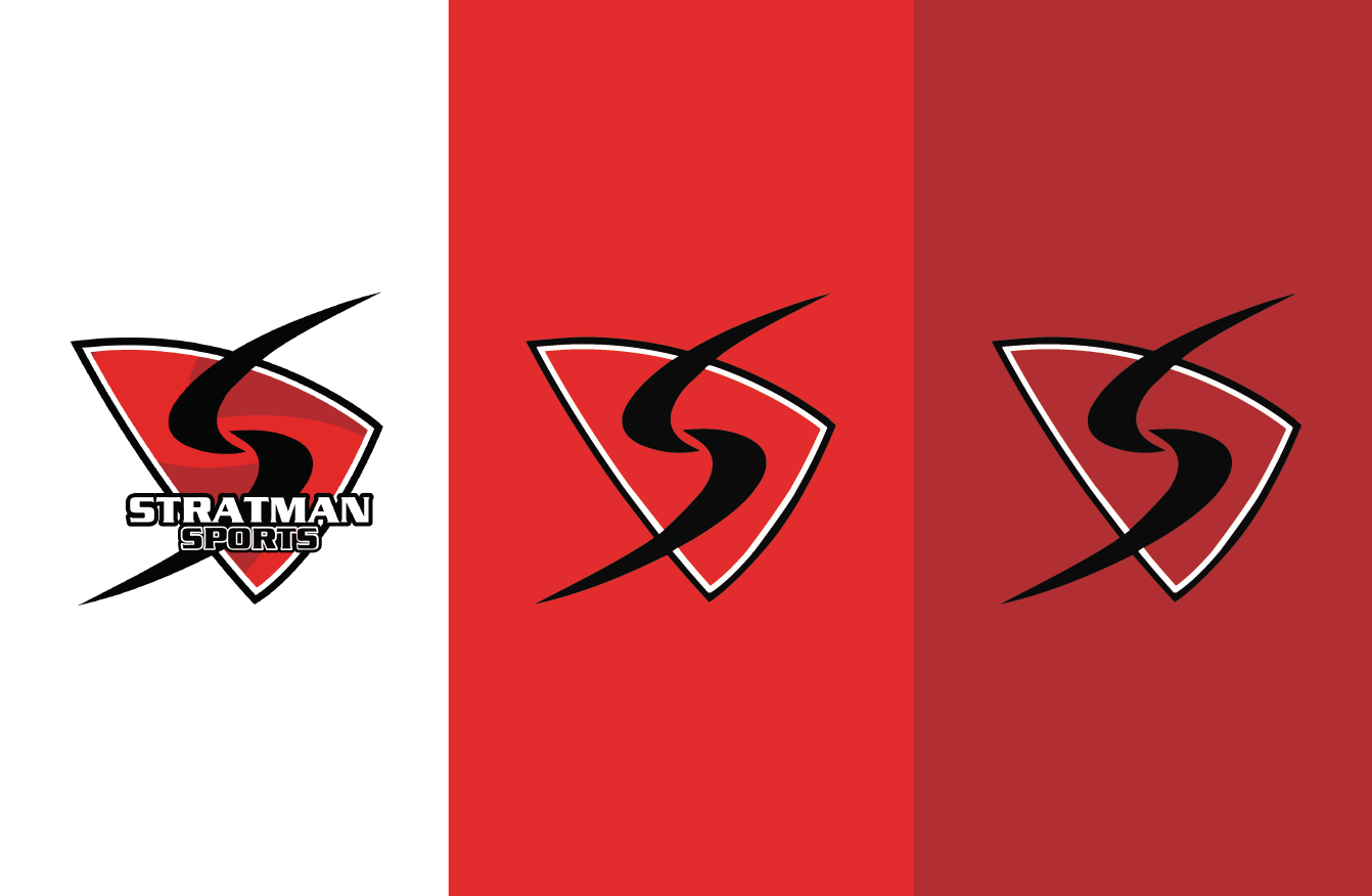
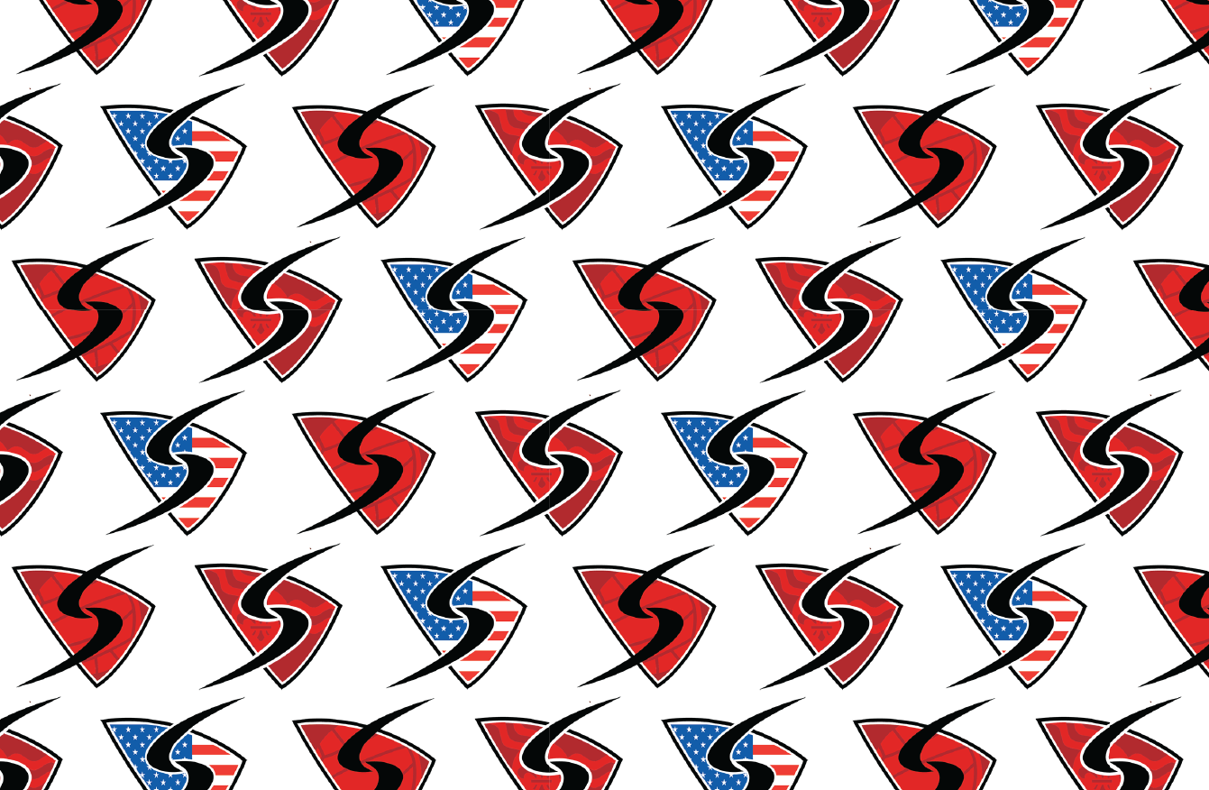
To achieve the rebrand, I merged elements from a previous design with my own, integrating the “S” typography from the original concept while incorporating my shield, colors, and fonts. The shield became the key to versatility—it allowed for interchangeable sports icons while maintaining a cohesive brand identity. To ensure consistency, all variations, including the St. Louis flag, volleyball, pickleball, and other court games, were adapted to the two reds from the main logo.
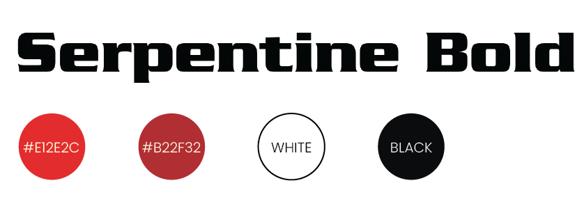
The font choice balanced boldness with an athletic feel, achieved through outlines and double outlines—a widely recognized design technique in sports branding.