Body & Sole Massage Therapy is a sanctuary for relaxation and healing, offering expert massage treatments that restore balance to the body and mind. Their skilled therapists specialize in a variety of techniques to alleviate tension, reduce stress, and promote overall well-being.
DELIVERABLES
Business Cards
Brochure
OBJECTIVES
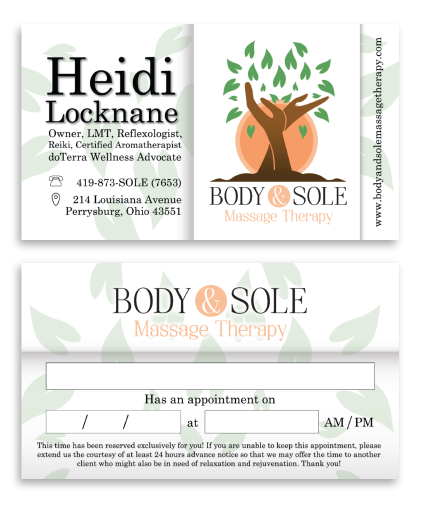
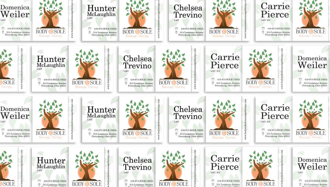
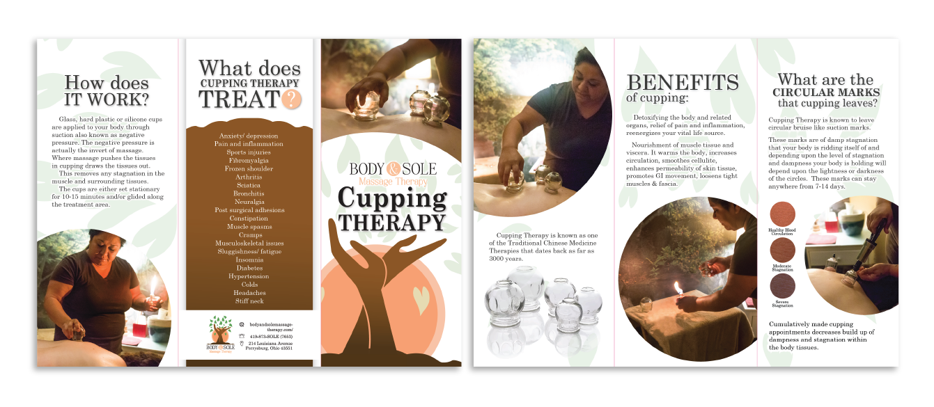
A business card incorporating the employee’s certifications, contact information, social media handles, and a lengthy business URL—all on one side. The reverse side should serve as an appointment reminder card with a disclosure statement. Additionally, they seek a brochure on cupping therapy, developed in collaboration with their trained cupping therapist, to educate clients on its benefits.
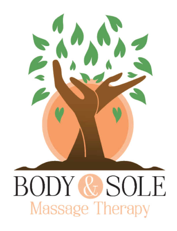
To maintain brand consistency, I selected a second serif font for textual content, ensuring easy readability while complementing the logo’s elegant typography. The leaves from the logo were transformed into a subtle background pattern, reinforcing brand identity without overwhelming the design.
To organize content, I incorporated paper fold effects with shadows, creating natural divisions between sections. On the front of the business cards, these folds structured the layout into three sections: contact information include employee name, certificated, business number and address; the new logo, and the website, while the back featured the business name at the top and an appointment reminder at the bottom, ensuring clarity and function.
These elements from the logo were used to strengthen Body and Sole’s brand identity. The leaves represent a grounding connection to the earth, while the circles symbolize continuity and connected energy. These shapes were applied throughout the designs, from photo cropping to icons like the “&” sign, creating a unified visual language. This approach deepened the brand’s message of holistic care and natural healing while maintaining design consistency.
For the brochure, the paper folds continue separating key details, particularly on the back, where they structured the list of cupping therapy health benefits. Circular elements were also utilized throughout the design—to crop photos, highlight skin reaction samples, and represent symbols such as question marks—maintaining a cohesive visual language.
Typography in the brochure focus on boldness and capitalization. Capitalization, reflecting the style of the logo, was strategically used in headers to emphasize important keywords, enhancing readability and reinforcing branding.
These project further developed Body & Sole’s brand aligning with core values of connection, grounding, and holistic healing.