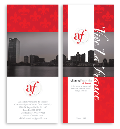
Alliance Francaise de Toledo
DELIVERABLES
- Brochure
OBJECTIVES
The brochure was for a booth event, created in collaboration with a copyright and grant writer. The brochure should highlight their mission, main language courses, and an events calendar to attract and inform potential members.
For the Alliance Française de Toledo brochure, I expanded on the logo’s colors, incorporating a second, darker red for contrast and adding grays and a gradient to bring depth and sophistication. To highlight the organization’s mission—bringing French education to Toledo—I wanted the design to emphasize Toledo’s local presence. I sourced a city shot of Toledo, provided by the client, to span the entire back of the brochure, creating a seamless view from bridge to bridge when the brochure was fully unfolded.
To balance the local representation with the French heritage, I incorporated the fleur-de-lis as a pattern throughout the design, using it as bullet points to subtly connect the French influence with Toledo. This combination of design elements ensured the brochure was both visually striking and meaningful, reflecting the organization’s mission to connect French culture with the Toledo community.
Looking back, several improvements could enhance the design of the Alliance Française de Toledo brochure. Increasing the margins at the top and bottom of the calendar event section would create balance and readability, while moving the March event over would decongest the middle panel. On the first inside panel, reducing separation between content would create a more cohesive layout.
Increasing the contrast between the text and the grey gradient background is crucial for better legibility. Repositioning the “Group Instruction” title within the grey box would improve organization. For the front page, adding spacing between the organization’s name and text below would make the design cleaner. Softening the white line along the city image would improve the transition, and adjusting the size of the fleur-de-lis pattern would balance the design. These changes would improve both readability and aesthetics.